
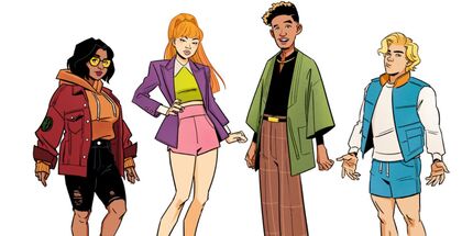
 Some early concept art for Velma has been shared, and it looks completely different than what we ended up getting. Earlier last week, artist Annie Wu posted some pieces of early concept art for the show on Twitter, which was covered in an article by CBR. In my opinion, this early concept art animation actually looks a lot better than what we ended up getting. You can view a few other pictures of concept art in the Twitter thread. 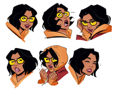
15 Comments
Lamont
1/23/2023 07:47:27 pm
Replying to your comment on the last post on this one. 1/23/2023 08:38:15 pm
Completely agreed; I personally prefer things that naturally have a mature feel (in the "show, not tell" sense), rather than them doing things like playing a song repeating "I'm a badass motherf**er" over and over like they did in episode 3 lol. Tons of inappropriateness and "adult content" does not equal maturity IMO.
Becker
1/24/2023 07:20:30 am
This artstyle is not my thing, these designs don't really do it for me. It's more appealing than the style they went for though. However, if you combine this artstyle with the exact same writing and execution of the Velma show we have, it wouldn't mesh as well. You'd need a totally different vibe and approach for this style to work at all. 1/24/2023 10:47:46 am
Yeah, I agree that it wouldn’t have worked with the tone of the show that we got. I think that’s probably why I like this so much: it makes me think about how the show could have been a lot better if it were different haha.
Carson Maitland - Smith
1/24/2023 07:29:40 am
🧡💜💚💙
Gibby Norton
1/24/2023 10:44:46 am
These designs are better than the ones they are currently using, but they also look infinitely more expensive than I’m sure the show already is. I would say that is probably the biggest reason as to why these designs aren’t being used. But also I think much like with Be Cool, these designs don’t fit the style of comedy that Velma is aiming for. That style of comedy I speak of is being cringe of course, lol. 1/24/2023 10:50:31 am
Haha, I agree that this animation style would not have fit the “cringe” comedy and tone. It would have been cool to get this style, but only if we would have gotten a more mature series (mature in the sense of less inappropriateness, not more edgy “adult themes.”).
Dimitri Brenick
1/25/2023 07:13:39 am
these are still pretty bad though and infact i feel fred's somehow even worse than what we got. 1/25/2023 07:32:01 am
Fred does look really weird to me too. IMO I don't know if he's worse than what we got, but I'd say he's just as bad.
Amber noel
1/25/2023 03:44:10 pm
I like Velma's design but I am not sure about the others. 1/25/2023 04:14:27 pm
I would say Velma's design is my favorite of the bunch. If I had to rank the others, I'd say Shaggy would be second, Daphne would be third, and Fred would be an easy fourth. Fred's the only design of the group that I don't like. 1/25/2023 08:24:57 pm
Possibly an unpopular opinion, but Daphne's final design in the show is actually the one I don't really mind. I agree that this Daphne and Shaggy look a lot better, though.
Tanner Flores
1/26/2023 04:39:05 pm
These designs are really cool, but I think they might work better if "Velma" was a comic instead of a show, which honestly, may not have been the worst idea. 1/26/2023 04:52:57 pm
I agree! These designs would have made a cool comic series! Leave a Reply. |
AuthorWildwindVampire Categories
All
Archives
April 2024
|
 RSS Feed
